
projects
.
projects
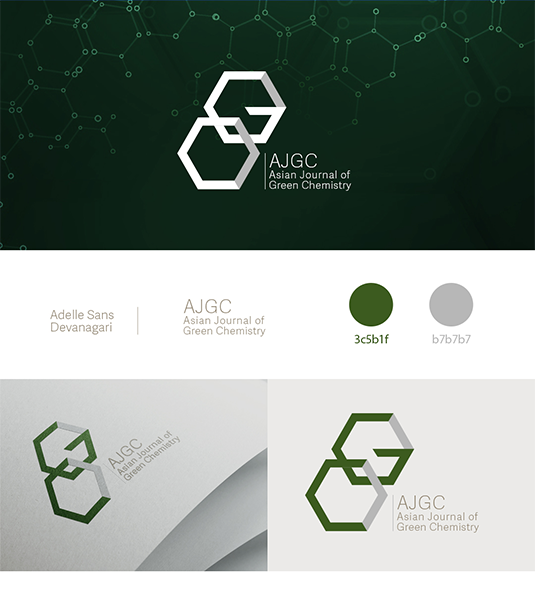
asian journal of green chemistry
Tehran, 2019
This project began with the challenge of creating a visual identity for a scientific journal focused on green chemistry, without relying on predictable environmental symbols. The concept was developed from the visual language of chemistry itself, using a chemical bond as the foundation of the mark. The logo is formed by two connected hexagonal shapes, each representing one of the initials G and C, and working together like a chain to suggest interaction, process, and continuity. The structure references molecular forms while remaining simple and legible, allowing the logo to feel both scientific and contemporary. Green was used deliberately and sparingly, reinforcing the journal’s environmental focus while maintaining the seriousness and clarity required in an academic context.
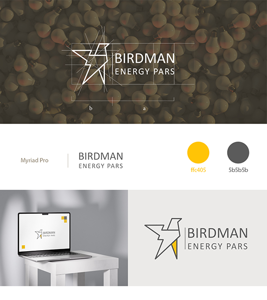
Birdman Energy Pars
Tehran, 2019
This project involved designing a logo for a company working in new energy systems, with the concept developed around the first part of the name, Birdman. The mark is built as a minimal, abstract interpretation of an eagle, positioned upright on its legs to subtly echo the human figure suggested by the name. Sharp corners and triangular forms were used throughout the design to convey power, direction, and energy. The structure is composed of two triangles forming the legs and body, a combined set of triangles shaping the head, and a single side-view triangle for the wing, which is fractured to resemble a spark or flame—an explicit reference to energy in motion. A bright yellow accent was applied to the front leg to emphasize strength, forward movement, and decisive steps, symbolizing the company’s role in forging a new path within the energy sector.
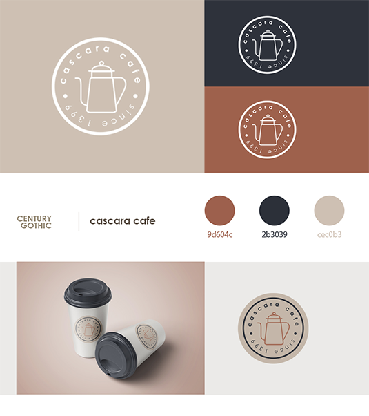
Cascara Cafe
Tehran, 2019
This project involved designing a logo for a coffee shop named Cascara, a word with Latin roots referring to the dried skin of the coffee cherry, the fruit that holds the coffee bean at its center. The concept began with the natural form of the cherry itself: a near-circular shape and its surrounding skin. A thin, lined circle was used to represent both the roundness of the fruit and its outer layer, while a coffee pot was placed at the center in place of the bean, shifting the focus from the ingredient to the act of brewing and gathering. The name and opening year were set along the inner edge of the circle, reinforcing the layered structure of the fruit and creating a sense of continuity. The color palette draws from Cascara’s cultural and geographic references: a khaki base reflecting its historical use in Arab regions, a warm brown that nods to coffee without directly mimicking its color, and a deep, dark blue inspired by the atmosphere of Latin nights, moments of conversation, ritual, and café culture where cascara becomes part of a shared experience.

Daida Notebooks
Tehran, 2022
This project involved designing the visual identity for Daida, a notebook brand that required flexibility across language, product type, and age group. The initial logo was created in Persian for the main office, followed by a second bilingual version designed for products distributed nationwide. The concept was built around the physical forms of a book itself, open pages, a closed volume, and the book spine; using these structures as the basis for the letterforms. The same visual logic was then applied to both languages, allowing the Persian and Latin versions to feel related rather than translated. Beyond the logo system, the project expanded into the design of notebook covers, interior page layouts, and an annual planner, developed in a comprehensive and interactive style to suit users of different ages.
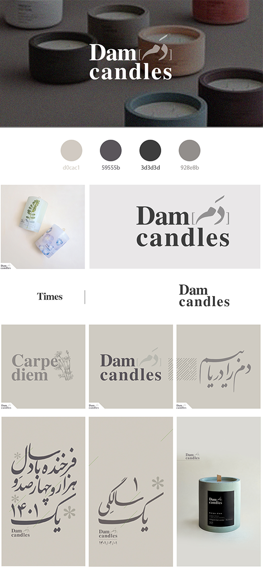
Dam candles
Tehran, 2021
Dam Candles is a branding project rooted in Persian language and literature, developed for a candle-making studio whose name carries a deeply poetic meaning. “Dam” in Persian refers to the length of a single breath—a moment so brief it is almost imperceptible, yet repeated countless times throughout a lifetime, often conceptually translated as Carpe Diem. This idea directly connects to the nature of a burning candle: each second of its flame is a moment that can never be repeated, much like a breath once taken. The logo combines the English phrase Dam Candles with the word “Dam” rendered in Persian calligraphy, bringing together cultural heritage and contemporary form. A pairing of Persian calligraphic lettering with an old-style serif typeface was chosen to preserve the poetic tone of the name while grounding it in a timeless visual language. To express the lightness and invisibility of the concept, the identity relies on subtle layers of gray and delicate diagonal lines. These elements reference both the gentle movement of breath and the small, almost unnoticeable shifts of a candle flame responding to air and human presence. The same diagonal gesture also recalls the Persian diacritical mark used to form the “a” sound in “Dam,” allowing language, meaning, and material behavior to merge into a quiet, atmospheric visual system used consistently across the logo and social media presence.
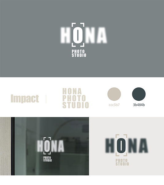
Hona photo studio
Seattle, 2022
The idea behind this logo was to translate the physical and visual experience of photography into a typographic mark. A bold, heavy sans-serif typeface was chosen to convey modernity, but also to echo the tangible weight of a camera held in the hands while looking through the viewfinder. The composition plays with focus: the letters H, N, and A are intentionally blurred, while the O remains sharp, acting as the visual anchor of the logo. This contrast references the moment of focusing through a lens, with the O subtly recalling the circular shape of a camera lens itself. The framing marks placed at the four corners further reinforce the idea of the visor, placing the viewer directly in the photographer’s point of view. The result is a restrained identity that feels experiential, capturing not just the studio’s name, but the act of seeing through a camera.

HTNprime Company
Tehran, 2018-2022
This project represents a four-year design collaboration with HTNprime, one of the leading brands in the production of door handles and locks. The company entered the process with an existing logo and established brand colors—black and red—which they wanted to keep. The challenge was to change the overall atmosphere while remaining loyal to these foundations. Shades of gray and gold were added to elevate the brand and align it with the luxury quality of the products. We developed a main visual pattern based on the forms of the logo and then used different colors and pattern variations across various advertising materials to show the diversity and aesthetics of their designs, while still keeping the brand recognizable. Since the product itself was the priority, we used a minimal and geometric visual language to keep distractions to a minimum and allow the products to stand out. Over these four years, we designed a wide range of printed and digital materials, including packaging, calendars, office environmental graphics, billboards, festival visuals, magazine layouts, social media content, brochures, and catalogs.
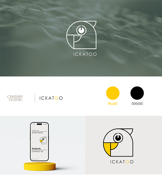
Ickatoo Smart Products
Tehran, 2020
Lorem ipsum dolor sit amet, consectetur adipiscing elit, sed do eiusmod tempor incididunt ut labore et dolore magna aliqua.
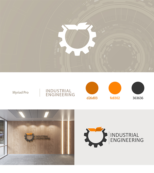
Industrial Engineering Journal
Tehran, 2019
This logo was designed to visually connect the two core elements of the Industrial Engineering Journal: industry and knowledge production. A gear wheel was used as the primary form to represent engineering, systems, and industrial processes, while an open journal was integrated into the top of the gear as an active structural element rather than a separate symbol. The journal is shown mid-motion, with one page turning to the right, suggesting progress, research development, and continuous learning. While the gear is a solid dark gray, a bright orange accent was applied to the journal shape with the turning page to emphasize movement and forward momentum, reinforcing the idea that as the gear rotates, knowledge advances alongside it. The result is a cohesive mark that balances mechanical precision with intellectual growth, expressing the journal’s role in driving industry forward through research.
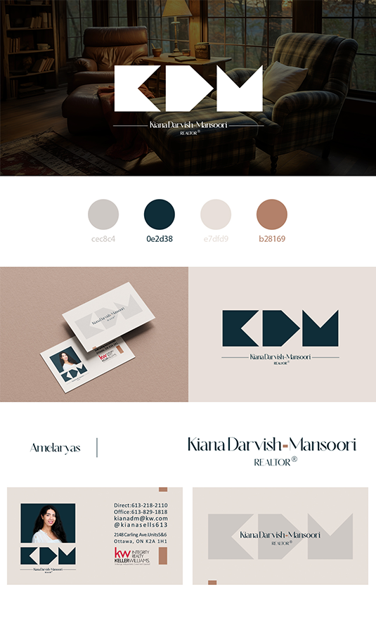
Kiana Darvish Mansoori realtor
Ottawa, 2024
This logo was designed around the initials of the name, using K, D, and M as the foundation of the visual system. The forms were developed by carving the letters out of a square structure, referencing the idea of four walls as the most basic definition of home and living space. The letter D was shaped like the simple house form many people draw in childhood, complete with a triangular roof, tapping into a shared and intuitive visual memory. Solid, filled shapes were used throughout the mark to emphasize the idea of space existing within form, rather than line or outline alone. When placed next to each other, the three elements subtly resemble directional arrows through their triangular geometries, suggesting movement, choice, and transition. This reflects the nature of the real-estate business itself, continually moving from one home to another, with new possibilities always ahead.
Lotus Architecture studio
Tehran, 2020
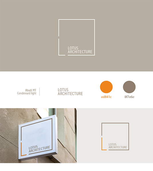
This logo was designed to reflect the sense of order and structure that is often immediately associated with architecture, while also referencing the earliest idea of what humans called home. The concept began with the square as a primary form, recalling the ancient act of defining space by building four walls and placing a roof above them. A thin-lined square was drawn and subtly interrupted to create the initial L for Lotus, formed by two deliberate cuts that transform one corner into a functional letter rather than a decorative element. The full studio name sits within the frame in a clean, straight sans-serif typeface, reinforcing clarity and precision. A warm grey, inspired by soil and raw building materials, grounds the identity, while the L is highlighted in orange to introduce contrast and movement. This subtle intervention brings a sense of innovation to a structured form, reflecting the studio’s approach to rethinking familiar architectural systems.
Mehr77 Bakery
Tehran, 2020
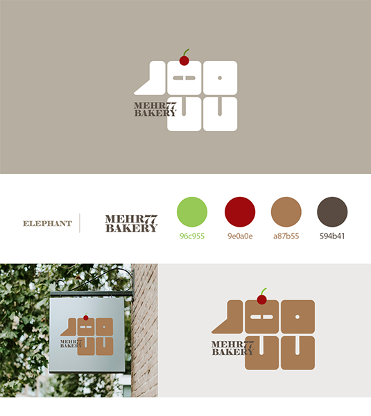
This logo was designed for a bakery named Mehr 77, a reference to a specific time, Mehr, the seventh month of the Iranian calendar, and the year 77, corresponding to September 1998. The identity draws from both memory and material, combining soft forms with subtle, cube-like geometry to evoke the textures and structure of baked goods such as cakes and cookies. Warm, brown-toned colors were used to reinforce this sensory association, while the name was written in Persian using a typeface originally designed in the 1990s, allowing the visual language to carry the same sense of time embedded in the name itself. To introduce a light, playful note, a simple cherry was added on top of the composition as a small visual wit, an understated nod to sweetness, finishing touches, and the pleasure of baking.
Music Instructor Series
Tehran, 2022-2024
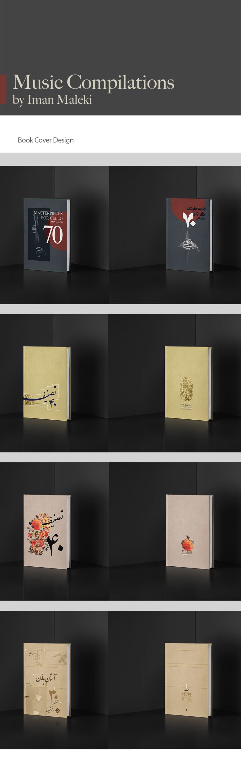
This project involved designing a series of book covers for music instruction books, with each cover developed in direct response to the style and repertoire of the pieces inside. For the cello volume, the visual language was inspired by the atmosphere of classical opera, using dark gray tones and a restrained composition featuring a cellist seated in shadow. This approach reflects the instrument’s role in depth, rhythm, and supporting sound, often felt more than seen. In contrast, the books focused on Persian music were designed with a richer, more ornamental visual language, drawing from Persian color palettes, traditional motifs such as floral and bird illustrations, and Persian calligraphy. These elements echo the emotional, poetic, and cultural character of Persian music, allowing each cover to visually translate the sound and spirit of the compositions it contains.
Novindrak Agricultural Products Advertisment
Tehran, 2022
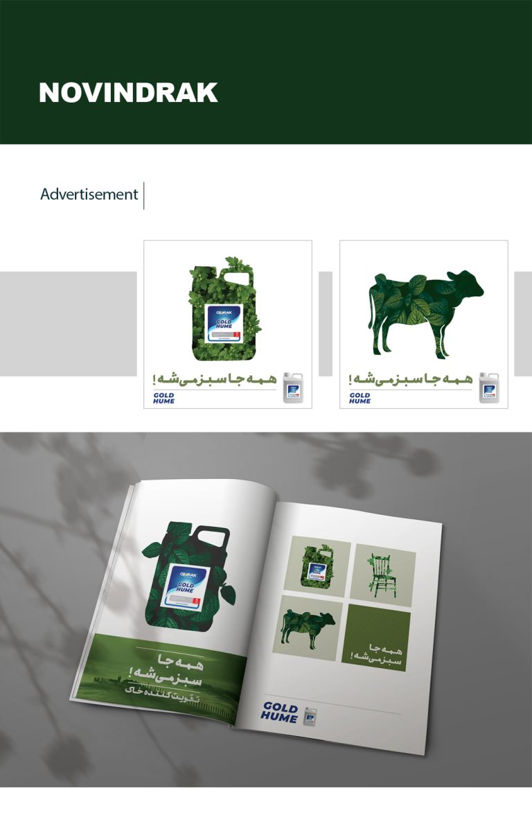
This advertising campaign was developed for Novindrak, a company producing large-scale soil and plant treatments for agricultural use, during the launch of a powerful fertilizer designed to restore even poor-quality soil and enable plant growth. The central idea was built around the exaggerated statement “Everything turns green,” translating the product’s effectiveness into a visually immediate and slightly playful concept. Familiar objects were reduced to simple silhouettes and filled entirely with dense plant textures, suggesting that growth had overtaken their surfaces, with leaves breaking beyond the boundaries of each form to emphasize abundance. The key visual featured a cow, supported by a series of secondary images including everyday objects such as a chair, sofa, table, bed, and the product container itself. To extend the idea beyond printed and digital media, the product introduction meeting included a small takeaway: a minimal gift bag containing only a green pen. This simple object allowed the message to live on in daily use, subtly reinforcing the idea that once growth begins, everything (even the smallest gestures) starts to turn green. The campaign was rolled out across billboards, magazines, and social media, designed to communicate impact quickly and memorably.
Ottawa Rideau soccer team
Ottawa, 2024
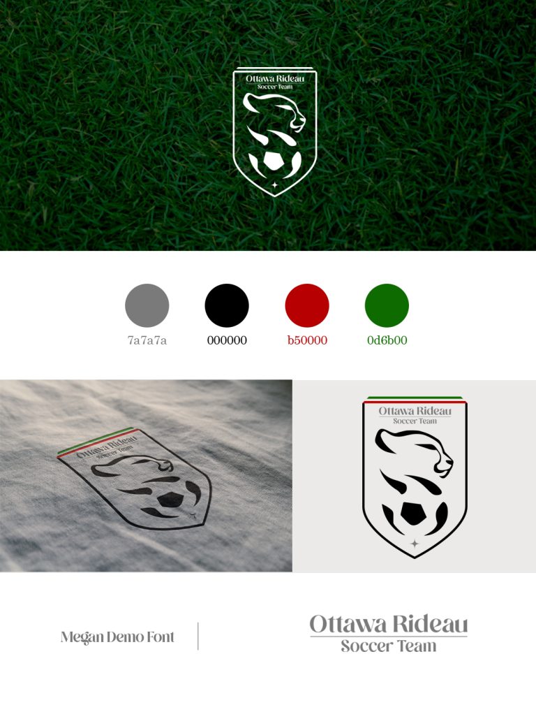
This logo was designed for a Persian soccer team based in Ottawa, named after a local place while intentionally carrying a distinctly Iranian visual identity. The concept centers on the Iranian cheetah, a national symbol facing extinction, chosen both for its cultural significance and for its speed, agility, and resemblance to the movement of a soccer player in motion. The mark is framed within a medallion-like form, suggesting honor, belonging, and the pride of being part of the team, with narrow lines of the Iranian flag subtly placed at the top. A simplified side-view cheetah is shown above a soccer ball, with the animal’s body and dark spots gradually merging into the soccer ball and the black segments of it. This transition creates a visual metaphor for motion and speed, as if the cheetah and the ball are becoming one within the flow of the game. The result is an identity that balances athletic energy, cultural symbolism, and a strong sense of collective pride.
Papyrus press
Tehran, 2017
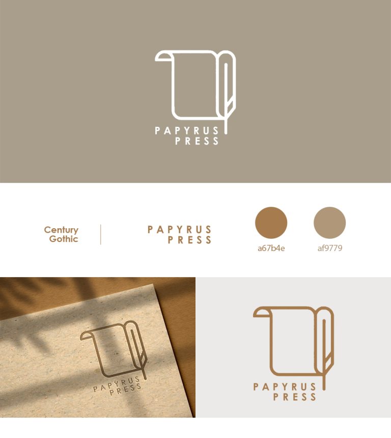
The logo for Papyrus Press was designed with a direct reference to the origins of writing and publishing. The concept combines two familiar historical elements: a simple papyrus form and a feather, recalling the tools once used to write and record knowledge in the ancient world. The composition is intentionally minimal, allowing the symbols to feel immediate and timeless rather than illustrative. An ochre color was chosen to reference the natural tone of papyrus and aged paper, a material still associated with tradition, literature, and history. Together, the form and color create an identity that quietly evokes antiquity and craftsmanship while remaining clear and usable in a contemporary publishing context.
Plunder documentari
Tehran, 2018
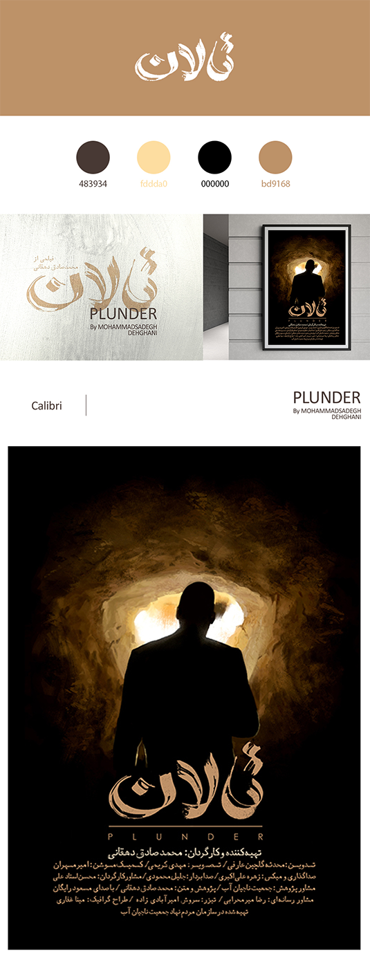
The branding for Talan (Plunder) was developed for a documentary exploring water exploitation and the long-term damage caused by uncontrolled extraction of underground and surface water resources. The visual identity draws directly from the physical reality of the subject matter, with a color palette rooted in soil and mud tones, referencing land stripped of moisture and resilience. The logo began as a raw, physical gesture: the film’s name was written on a concrete surface using a straight piece of wood, writing with partially wet, partially dry mud, then captured and refined into a final mark. This process allowed material and meaning to merge, reflecting the tension between what is still alive and what has already dried out. The supporting typeface used across posters and promotional materials carries the same soiled texture and softened edges, avoiding sharpness to reinforce erosion and decay. The main poster image features a rural man revealing the dryness of water reserves, illuminated by a flashlight against a dark background, an image that echoes the visual language of theft and secrecy. This reference reinforces the film’s central conflict: an unresolved question of responsibility between local communities, researchers, officials, and large industries, and the quiet, ongoing plunder of a shared natural resource.
Rosemall Opening Billboards
Tehran, 2021
Lorem ipsum dolor sit amet, consectetur adipiscing elit, sed do eiusmod tempor incididunt ut labore et dolore magna aliqua.
Roshanak Lingerie Brand
Tehran, 2023
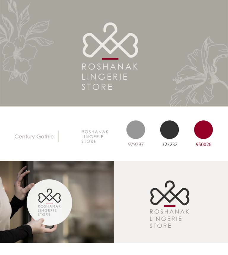
This branding project was developed for Roshanak, a lingerie brand with multiple retail branches, where femininity, delicacy, and softness shaped the entire visual language. The logo is built around a clothing hanger that subtly transforms into a bow at its center, with the ends of the bow shaped like hearts. This bow form also gently recalls the shape of a bra, referencing the product category without using a literal or explicit symbol. Curved forms, thin-lined strokes, and a restrained color palette were used throughout both the symbol and the typography to reinforce a feminine and elegant presence. Light gray was chosen as the primary color to create a soft, unobtrusive feeling, aligning with the intimate nature of underwear rather than drawing attention too aggressively. Magenta appears as a subtle accent, introducing warmth and sensitivity. Together, the forms, line quality, and colors create an identity that feels intimate, graceful, and intentionally understated.
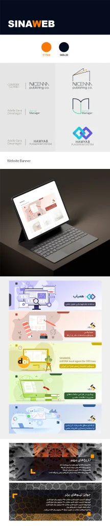
Sinaweb Online Journal Publishing
Tehran, 2017-2021
Lorem ipsum dolor sit amet, consectetur adipiscing elit, sed do eiusmod tempor incididunt ut labore et dolore magna aliqua.
Advance Researches in Civil Engineering journal
Tehran, 2018
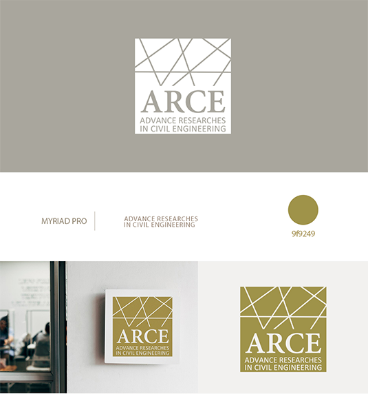
This logo was designed to reflect both the structural foundations of civil engineering and the innovative direction of advanced research. The concept began with a solid square, used as a container for the journal’s name, representing stability, construction, and engineered structure. Within this form, a series of linear elements were introduced to suggest rhythm and structural systems, then subtly shifted away from perfect order to express experimentation and new approaches within the field. A combination of serif and sans-serif typefaces was used to bring together the traditional and contemporary sides of civil engineering, suggesting that established knowledge and new methods now work hand in hand. A greenish-yellow color was chosen to convey movement and energy while also referencing environmental awareness and sustainable thinking. The final mark balances discipline and structure with progress and innovation.
Monik Designer Brand
Tehran, 2021
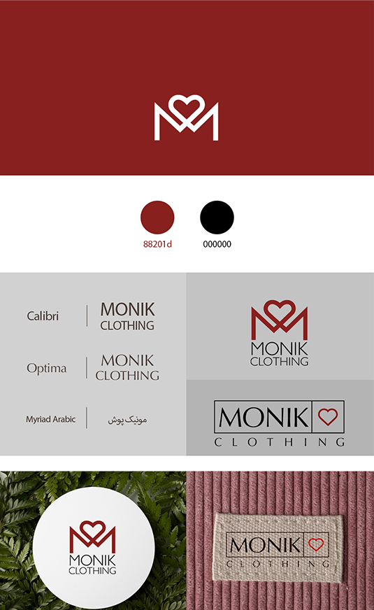
This branding project was developed for Monik, a designer cozy-wear brand focused on comfortable home clothing for families. The logo concept began with the letter M, shaped to include a heart form at its center, symbolizing family members coming together through warmth and care. This gesture allowed the mark to feel both personal and familiar, reinforcing the emotional side of home wear rather than treating it as purely functional clothing. A pure red color was chosen to strengthen the sense of warmth, closeness, and affection associated with family life. Alongside the primary logo, a secondary mark was designed for use on interior clothing labels, featuring the brand name paired with a simple red heart within a square. This supporting identity maintains consistency while allowing the brand to live comfortably across garments and everyday touchpoints.
Asian journal of green chemistry
Tehran, 2019
This project began with the challenge of creating a visual identity for a scientific journal focused on green chemistry, without relying on predictable environmental symbols. The concept was developed from the visual language of chemistry itself, using a chemical bond as the foundation of the mark. The logo is formed by two connected hexagonal shapes, each representing one of the initials G and C, and working together like a chain to suggest interaction, process, and continuity. The structure references molecular forms while remaining simple and legible, allowing the logo to feel both scientific and contemporary. Green was used deliberately and sparingly, reinforcing the journal’s environmental focus while maintaining the seriousness and clarity required in an academic context.
Asian journal of green chemistry
Tehran, 2019
Birdman Energy Pars
Tehran, 2019
This project involved designing a logo for a company working in new energy systems, with the concept developed around the first part of the name, Birdman. The mark is built as a minimal, abstract interpretation of an eagle, positioned upright on its legs to subtly echo the human figure suggested by the name. Sharp corners and triangular forms were used throughout the design to convey power, direction, and energy. The structure is composed of two triangles forming the legs and body, a combined set of triangles shaping the head, and a single side-view triangle for the wing, which is fractured to resemble a spark or flame—an explicit reference to energy in motion. A bright yellow accent was applied to the front leg to emphasize strength, forward movement, and decisive steps, symbolizing the company’s role in forging a new path within the energy sector.
Birdman Energy Pars
Tehran, 2019
Cascara Cafe
Tehran, 2019
This project involved designing a logo for a coffee shop named Cascara, a word with Latin roots referring to the dried skin of the coffee cherry, the fruit that holds the coffee bean at its center. The concept began with the natural form of the cherry itself: a near-circular shape and its surrounding skin. A thin, lined circle was used to represent both the roundness of the fruit and its outer layer, while a coffee pot was placed at the center in place of the bean, shifting the focus from the ingredient to the act of brewing and gathering. The name and opening year were set along the inner edge of the circle, reinforcing the layered structure of the fruit and creating a sense of continuity. The color palette draws from Cascara’s cultural and geographic references: a khaki base reflecting its historical use in Arab regions, a warm brown that nods to coffee without directly mimicking its color, and a deep, dark blue inspired by the atmosphere of Latin nights, moments of conversation, ritual, and café culture where cascara becomes part of a shared experience.
Cascara Cafe
Tehran, 2019

Daida Notebooks
Tehran, 2022
This project involved designing the visual identity for Daida, a notebook brand that required flexibility across language, product type, and age group. The initial logo was created in Persian for the main office, followed by a second bilingual version designed for products distributed nationwide. The concept was built around the physical forms of a book itself, open pages, a closed volume, and the book spine; using these structures as the basis for the letterforms. The same visual logic was then applied to both languages, allowing the Persian and Latin versions to feel related rather than translated. Beyond the logo system, the project expanded into the design of notebook covers, interior page layouts, and an annual planner, developed in a comprehensive and interactive style to suit users of different ages.
Daida Notebooks
Tehran, 2022
Dam candles
Tehran, 2021
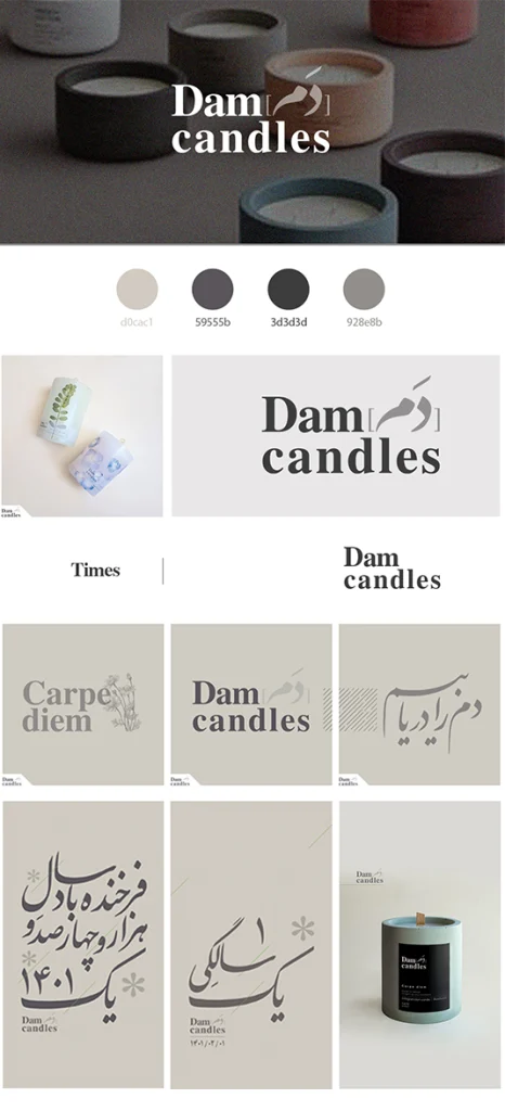
Dam Candles is a branding project rooted in Persian language and literature, developed for a candle-making studio whose name carries a deeply poetic meaning. “Dam” in Persian refers to the length of a single breath—a moment so brief it is almost imperceptible, yet repeated countless times throughout a lifetime, often conceptually translated as Carpe Diem. This idea directly connects to the nature of a burning candle: each second of its flame is a moment that can never be repeated, much like a breath once taken. The logo combines the English phrase Dam Candles with the word “Dam” rendered in Persian calligraphy, bringing together cultural heritage and contemporary form. A pairing of Persian calligraphic lettering with an old-style serif typeface was chosen to preserve the poetic tone of the name while grounding it in a timeless visual language. To express the lightness and invisibility of the concept, the identity relies on subtle layers of gray and delicate diagonal lines. These elements reference both the gentle movement of breath and the small, almost unnoticeable shifts of a candle flame responding to air and human presence. The same diagonal gesture also recalls the Persian diacritical mark used to form the “a” sound in “Dam,” allowing language, meaning, and material behavior to merge into a quiet, atmospheric visual system used consistently across the logo and social media presence.
Dam candles
Tehran, 2021
Hona photo studio
Seattle, 2022
The idea behind this logo was to translate the physical and visual experience of photography into a typographic mark. A bold, heavy sans-serif typeface was chosen to convey modernity, but also to echo the tangible weight of a camera held in the hands while looking through the viewfinder. The composition plays with focus: the letters H, N, and A are intentionally blurred, while the O remains sharp, acting as the visual anchor of the logo. This contrast references the moment of focusing through a lens, with the O subtly recalling the circular shape of a camera lens itself. The framing marks placed at the four corners further reinforce the idea of the visor, placing the viewer directly in the photographer’s point of view. The result is a restrained identity that feels experiential, capturing not just the studio’s name, but the act of seeing through a camera.
Hona photo studio
Seattle, 2022

HTNprime Company
Tehran, 2018-2022
This project represents a four-year design collaboration with HTNprime, one of the leading brands in the production of door handles and locks. The company entered the process with an existing logo and established brand colors—black and red—which they wanted to keep. The challenge was to change the overall atmosphere while remaining loyal to these foundations. Shades of gray and gold were added to elevate the brand and align it with the luxury quality of the products. We developed a main visual pattern based on the forms of the logo and then used different colors and pattern variations across various advertising materials to show the diversity and aesthetics of their designs, while still keeping the brand recognizable. Since the product itself was the priority, we used a minimal and geometric visual language to keep distractions to a minimum and allow the products to stand out. Over these four years, we designed a wide range of printed and digital materials, including packaging, calendars, office environmental graphics, billboards, festival visuals, magazine layouts, social media content, brochures, and catalogs.
HTNprime Company
Tehran, 2018-2022
Industrial Engineering Journal
Tehran, 2019
This logo was designed to visually connect the two core elements of the Industrial Engineering Journal: industry and knowledge production. A gear wheel was used as the primary form to represent engineering, systems, and industrial processes, while an open journal was integrated into the top of the gear as an active structural element rather than a separate symbol. The journal is shown mid-motion, with one page turning to the right, suggesting progress, research development, and continuous learning. While the gear is a solid dark gray, a bright orange accent was applied to the journal shape with the turning page to emphasize movement and forward momentum, reinforcing the idea that as the gear rotates, knowledge advances alongside it. The result is a cohesive mark that balances mechanical precision with intellectual growth, expressing the journal’s role in driving industry forward through research.
Industrial Engineering Journal
Tehran, 2019
Kiana Darvish Mansoori realtor
Ottawa, 2024
This logo was designed around the initials of the name, using K, D, and M as the foundation of the visual system. The forms were developed by carving the letters out of a square structure, referencing the idea of four walls as the most basic definition of home and living space. The letter D was shaped like the simple house form many people draw in childhood, complete with a triangular roof, tapping into a shared and intuitive visual memory. Solid, filled shapes were used throughout the mark to emphasize the idea of space existing within form, rather than line or outline alone. When placed next to each other, the three elements subtly resemble directional arrows through their triangular geometries, suggesting movement, choice, and transition. This reflects the nature of the real-estate business itself, continually moving from one home to another, with new possibilities always ahead.
Kiana Darvish Mansoori realtor
Ottawa, 2024
Lotus Architecture studio
Tehran, 2020
This logo was designed to reflect the sense of order and structure that is often immediately associated with architecture, while also referencing the earliest idea of what humans called home. The concept began with the square as a primary form, recalling the ancient act of defining space by building four walls and placing a roof above them. A thin-lined square was drawn and subtly interrupted to create the initial L for Lotus, formed by two deliberate cuts that transform one corner into a functional letter rather than a decorative element. The full studio name sits within the frame in a clean, straight sans-serif typeface, reinforcing clarity and precision. A warm grey, inspired by soil and raw building materials, grounds the identity, while the L is highlighted in orange to introduce contrast and movement. This subtle intervention brings a sense of innovation to a structured form, reflecting the studio’s approach to rethinking familiar architectural systems.
Lotus Architecture studio
Tehran, 2020
Mehr77 Bakery
Tehran, 2020
This logo was designed for a bakery named Mehr 77, a reference to a specific time, Mehr, the seventh month of the Iranian calendar, and the year 77, corresponding to September 1998. The identity draws from both memory and material, combining soft forms with subtle, cube-like geometry to evoke the textures and structure of baked goods such as cakes and cookies. Warm, brown-toned colors were used to reinforce this sensory association, while the name was written in Persian using a typeface originally designed in the 1990s, allowing the visual language to carry the same sense of time embedded in the name itself. To introduce a light, playful note, a simple cherry was added on top of the composition as a small visual wit, an understated nod to sweetness, finishing touches, and the pleasure of baking.
Mehr77 Bakery
Tehran, 2020
Music Institute books
Tehran, 2022-2024
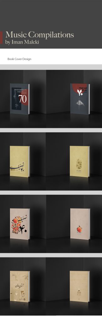
This project involved designing a series of book covers for music instruction books, with each cover developed in direct response to the style and repertoire of the pieces inside. For the cello volume, the visual language was inspired by the atmosphere of classical opera, using dark gray tones and a restrained composition featuring a cellist seated in shadow. This approach reflects the instrument’s role in depth, rhythm, and supporting sound, often felt more than seen. In contrast, the books focused on Persian music were designed with a richer, more ornamental visual language, drawing from Persian color palettes, traditional motifs such as floral and bird illustrations, and Persian calligraphy. These elements echo the emotional, poetic, and cultural character of Persian music, allowing each cover to visually translate the sound and spirit of the compositions it contains.
Music Institute books
Tehran, 2022-2024
Novindrak Agricultural Products Advertisment
Tehran, 2022
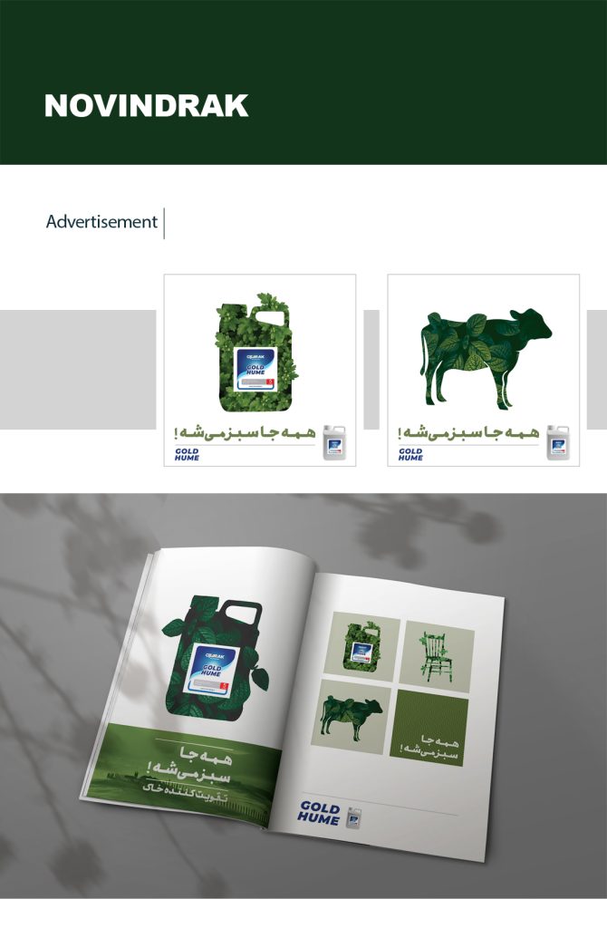
This advertising campaign was developed for Novindrak, a company producing large-scale soil and plant treatments for agricultural use, during the launch of a powerful fertilizer designed to restore even poor-quality soil and enable plant growth. The central idea was built around the exaggerated statement “Everything turns green,” translating the product’s effectiveness into a visually immediate and slightly playful concept. Familiar objects were reduced to simple silhouettes and filled entirely with dense plant textures, suggesting that growth had overtaken their surfaces, with leaves breaking beyond the boundaries of each form to emphasize abundance. The key visual featured a cow, supported by a series of secondary images including everyday objects such as a chair, sofa, table, bed, and the product container itself. To extend the idea beyond printed and digital media, the product introduction meeting included a small takeaway: a minimal gift bag containing only a green pen. This simple object allowed the message to live on in daily use, subtly reinforcing the idea that once growth begins, everything (even the smallest gestures) starts to turn green. The campaign was rolled out across billboards, magazines, and social media, designed to communicate impact quickly and memorably.
Novindrak Agricultural Products Advertisment
Tehran, 2022
Ottawa Rideau soccer team
Ottawa, 2024
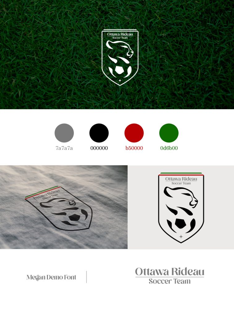
This logo was designed for a Persian soccer team based in Ottawa, named after a local place while intentionally carrying a distinctly Iranian visual identity. The concept centers on the Iranian cheetah, a national symbol facing extinction, chosen both for its cultural significance and for its speed, agility, and resemblance to the movement of a soccer player in motion. The mark is framed within a medallion-like form, suggesting honor, belonging, and the pride of being part of the team, with narrow lines of the Iranian flag subtly placed at the top. A simplified side-view cheetah is shown above a soccer ball, with the animal’s body and dark spots gradually merging into the soccer ball and the black segments of it. This transition creates a visual metaphor for motion and speed, as if the cheetah and the ball are becoming one within the flow of the game. The result is an identity that balances athletic energy, cultural symbolism, and a strong sense of collective pride.
Ottawa Rideau soccer team
Ottawa, 2024
Papyrus press
Tehran, 2017
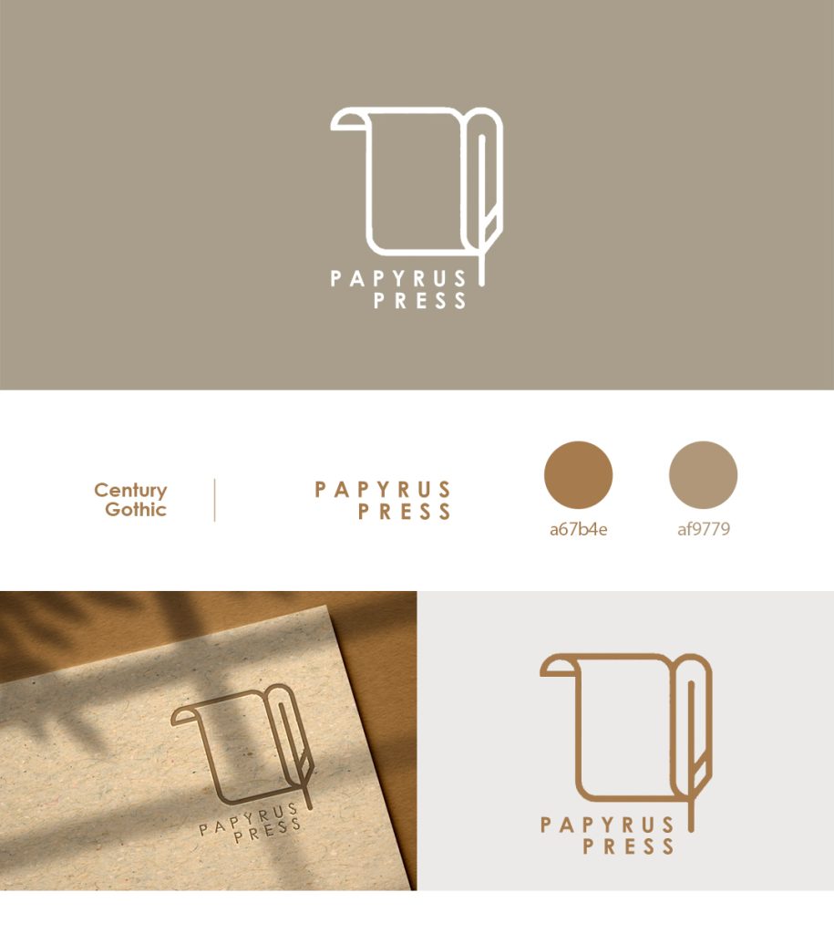
The logo for Papyrus Press was designed with a direct reference to the origins of writing and publishing. The concept combines two familiar historical elements: a simple papyrus form and a feather, recalling the tools once used to write and record knowledge in the ancient world. The composition is intentionally minimal, allowing the symbols to feel immediate and timeless rather than illustrative. An ochre color was chosen to reference the natural tone of papyrus and aged paper, a material still associated with tradition, literature, and history. Together, the form and color create an identity that quietly evokes antiquity and craftsmanship while remaining clear and usable in a contemporary publishing context.
Papyrus press
Tehran, 2017
Plunder documentari
Tehran, 2018
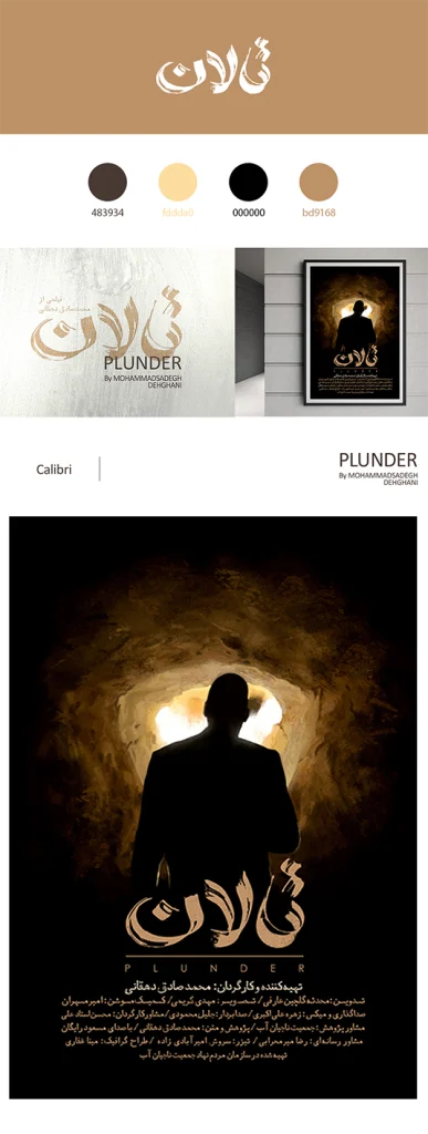
The branding for Talan (Plunder) was developed for a documentary exploring water exploitation and the long-term damage caused by uncontrolled extraction of underground and surface water resources. The visual identity draws directly from the physical reality of the subject matter, with a color palette rooted in soil and mud tones, referencing land stripped of moisture and resilience. The logo began as a raw, physical gesture: the film’s name was written on a concrete surface using a straight piece of wood, writing with partially wet, partially dry mud, then captured and refined into a final mark. This process allowed material and meaning to merge, reflecting the tension between what is still alive and what has already dried out. The supporting typeface used across posters and promotional materials carries the same soiled texture and softened edges, avoiding sharpness to reinforce erosion and decay. The main poster image features a rural man revealing the dryness of water reserves, illuminated by a flashlight against a dark background, an image that echoes the visual language of theft and secrecy. This reference reinforces the film’s central conflict: an unresolved question of responsibility between local communities, researchers, officials, and large industries, and the quiet, ongoing plunder of a shared natural resource.
Plunder documentari
Tehran, 2018
Roshanak Lingerie Store
Tehran, 2023
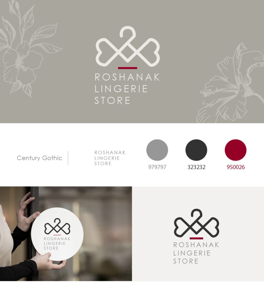
This branding project was developed for Roshanak, a lingerie brand with multiple retail branches, where femininity, delicacy, and softness shaped the entire visual language. The logo is built around a clothing hanger that subtly transforms into a bow at its center, with the ends of the bow shaped like hearts. This bow form also gently recalls the shape of a bra, referencing the product category without using a literal or explicit symbol. Curved forms, thin-lined strokes, and a restrained color palette were used throughout both the symbol and the typography to reinforce a feminine and elegant presence. Light gray was chosen as the primary color to create a soft, unobtrusive feeling, aligning with the intimate nature of underwear rather than drawing attention too aggressively. Magenta appears as a subtle accent, introducing warmth and sensitivity. Together, the forms, line quality, and colors create an identity that feels intimate, graceful, and intentionally understated.
Roshanak Lingerie Store
Tehran, 2023
Advance Researches in Civil Engineering journal
Tehran, 2018
This logo was designed to reflect both the structural foundations of civil engineering and the innovative direction of advanced research. The concept began with a solid square, used as a container for the journal’s name, representing stability, construction, and engineered structure. Within this form, a series of linear elements were introduced to suggest rhythm and structural systems, then subtly shifted away from perfect order to express experimentation and new approaches within the field. A combination of serif and sans-serif typefaces was used to bring together the traditional and contemporary sides of civil engineering, suggesting that established knowledge and new methods now work hand in hand. A greenish-yellow color was chosen to convey movement and energy while also referencing environmental awareness and sustainable thinking. The final mark balances discipline and structure with progress and innovation.
Advance Researches in Civil Engineering journal
Tehran, 2018
Monik Designer Brand
Tehran, 2021
This branding project was developed for Monik, a designer cozy-wear brand focused on comfortable home clothing for families. The logo concept began with the letter M, shaped to include a heart form at its center, symbolizing family members coming together through warmth and care. This gesture allowed the mark to feel both personal and familiar, reinforcing the emotional side of home wear rather than treating it as purely functional clothing. A pure red color was chosen to strengthen the sense of warmth, closeness, and affection associated with family life. Alongside the primary logo, a secondary mark was designed for use on interior clothing labels, featuring the brand name paired with a simple red heart within a square. This supporting identity maintains consistency while allowing the brand to live comfortably across garments and everyday touchpoints.
Monik Designer Brand
Tehran, 2021